UDCA Redesign
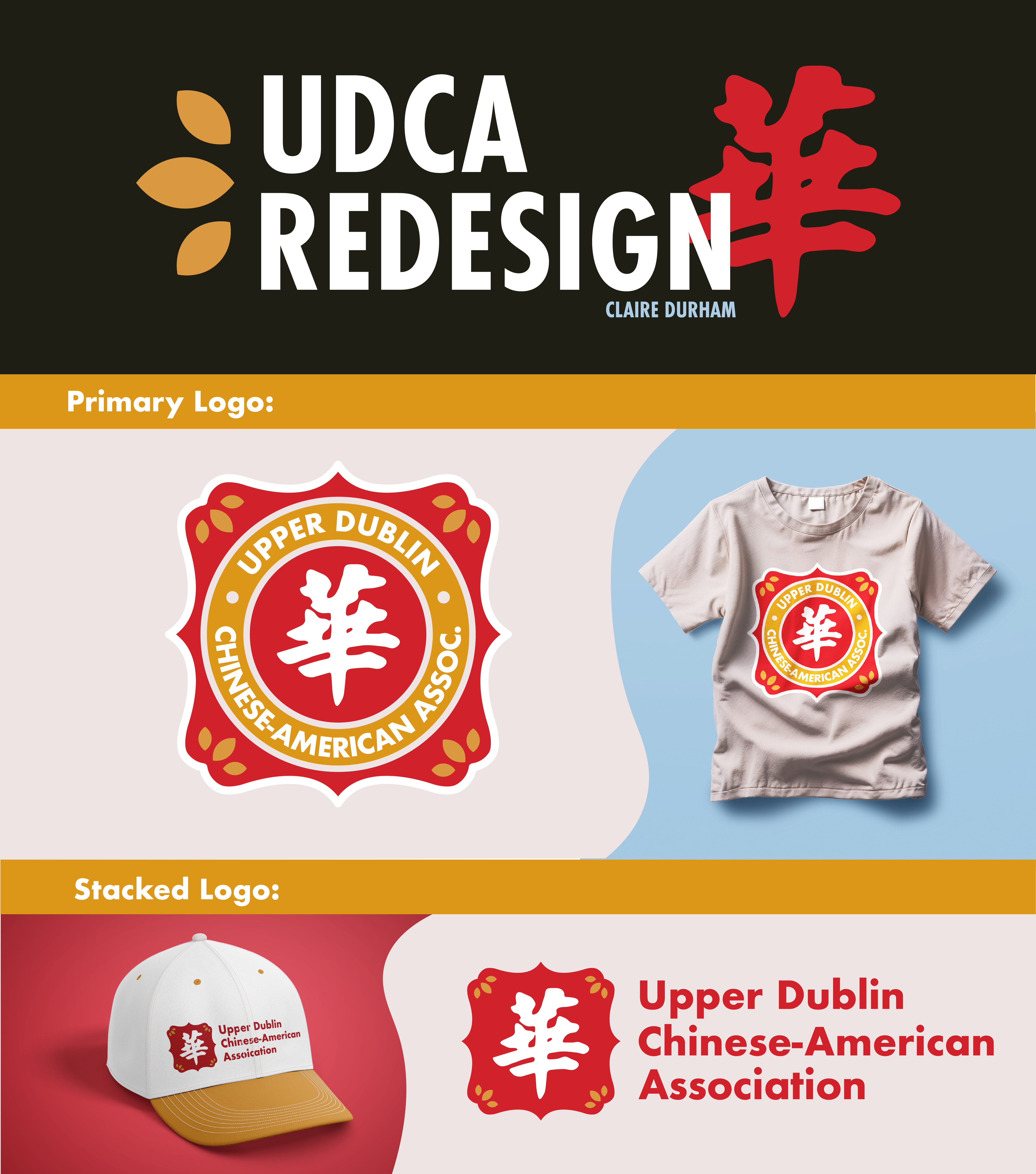
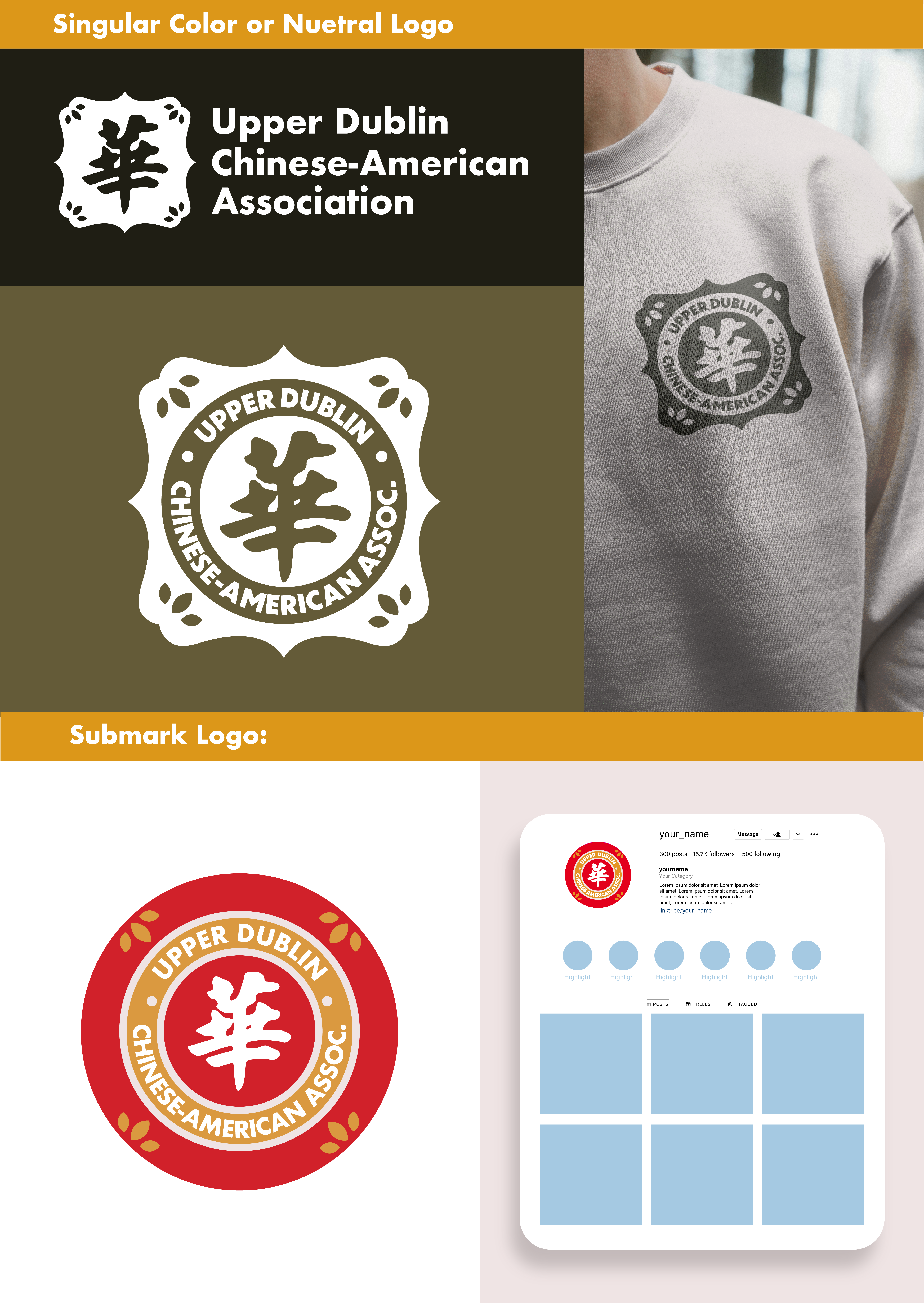
For the Upper Dublin Chinese American Association, I developed a refreshed visual identity that honors cultural heritage while presenting a modern, cohesive presence for the organization. The redesign draws inspiration from traditional Chinese design elements, particularly the use of geometric shapes.
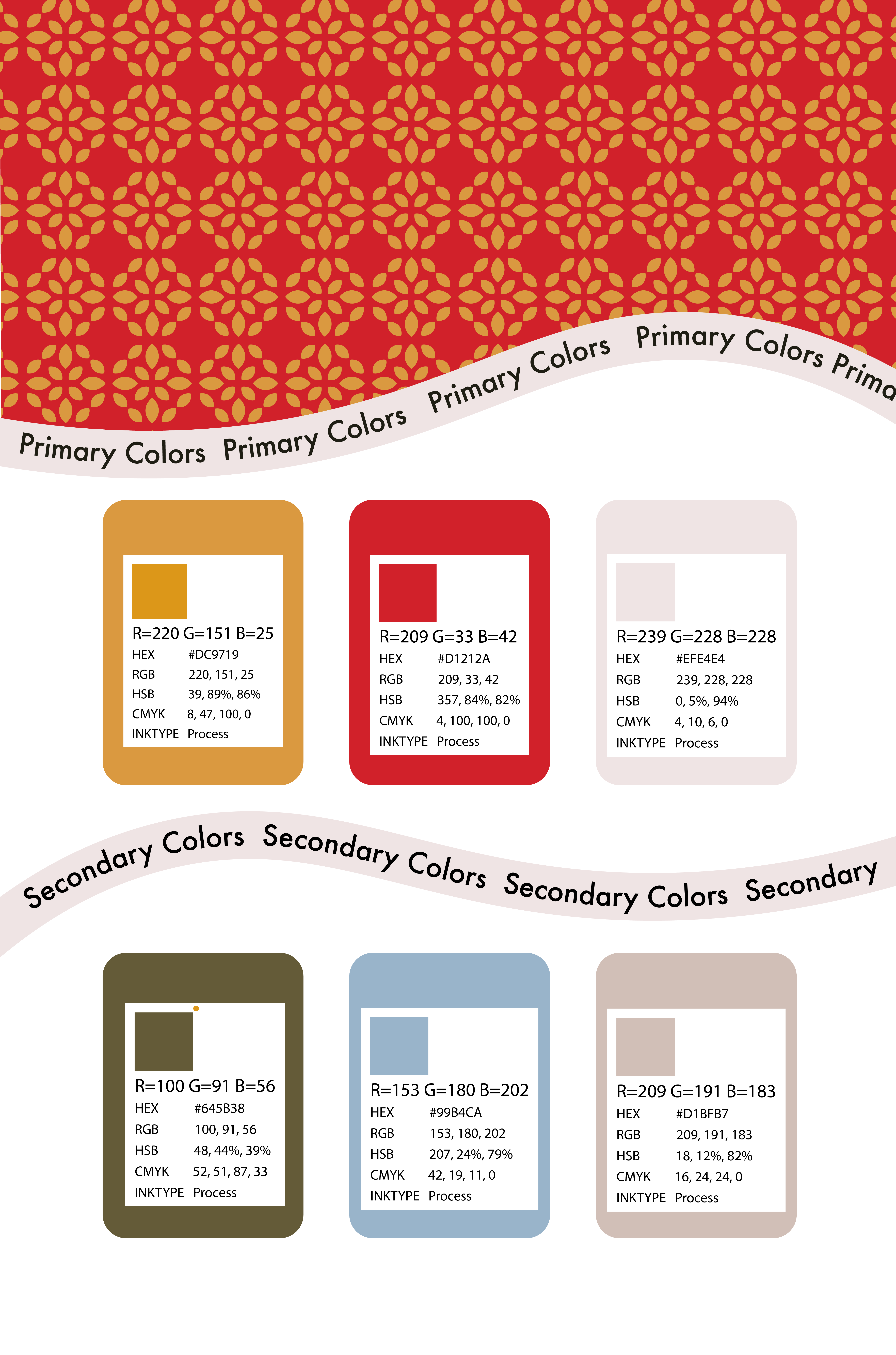
The color palette incorporates classic Chinese hues—rich reds symbolizing prosperity and joy, and complementary gold tones representing good fortune and strength. These colors were intentionally chosen to reflect cultural pride and community celebration while maintaining a bold, contemporary look.
It was important to the organization to include the Chinese Character, "华” or "Huá." This is an abbreviation for China and is commonly associated with Chinese culture and identity.
I experimented with incoorporating the small details of the log as well as the primary color palette into icons for the website.
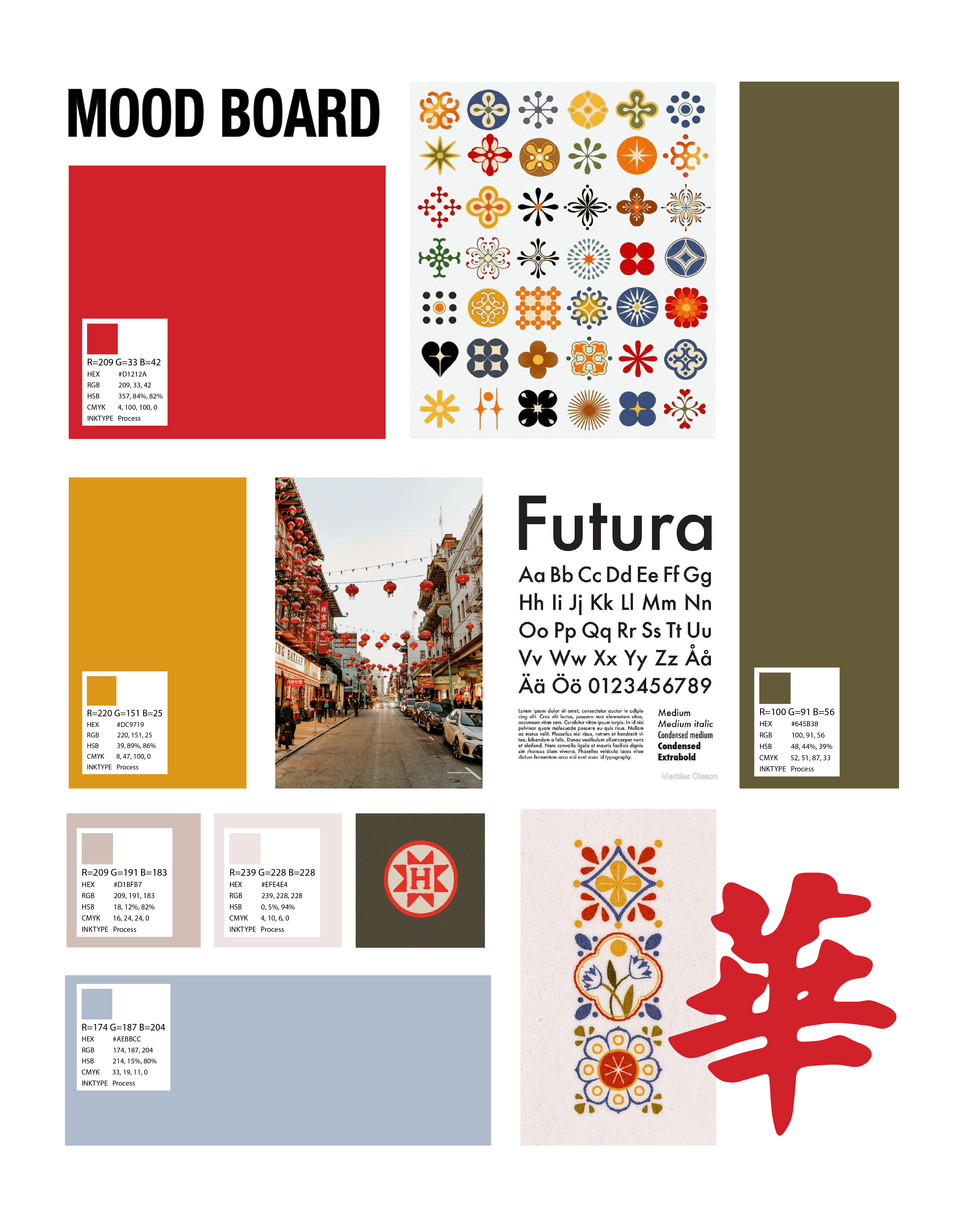
I was greatly inspired by these small geometric shapes that almost resembled traditinoal Chinese seal marks or stamps. I pulled colors from these shapes and images like ones seen in the middle of the Mood Board. I wanted the logo to appear clean and bold.
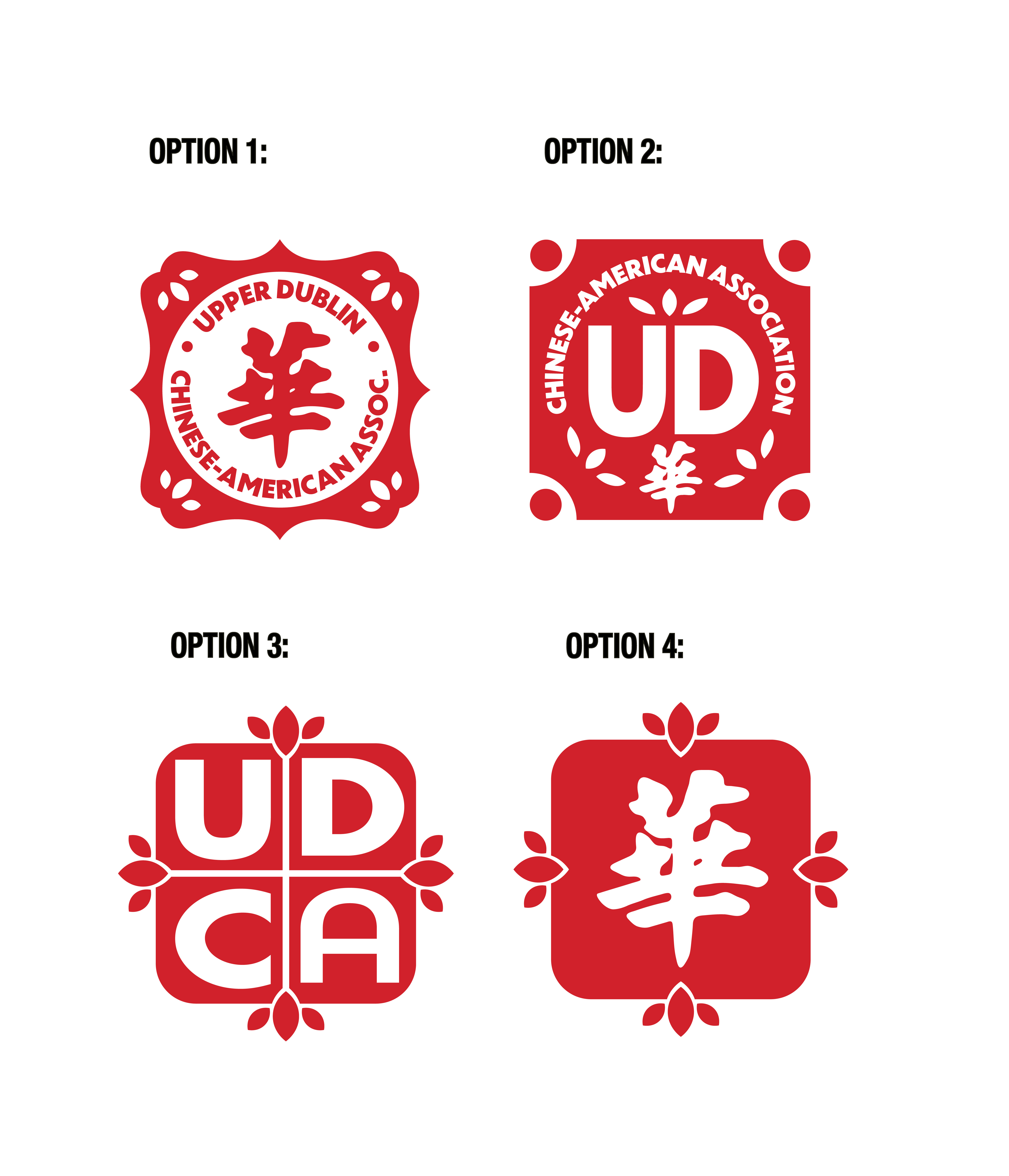
I developed four distinct logo directions for the client to choose from to explore varying balances between tradition and modernity.
The top two options lean more traditional in their approach. Both draw heavily from the stamps, incorporating circular framing, ornamental edge detailing, and symmetrical composition. These directions emphasize heritage and cultural continuity, with the Chinese character “华” remaining central to the design. The surrounding typography reinforces the organization’s full name, creating an identity that feels rooted in tradition.
In contrast, the bottom two options take a more modern, simplified approach. These marks reduce visual complexity and focus on bold and clean negative space. Option three integrates the initials “UDCA” into a structured, quadrant-based layout inspired by Chinese seal marks, while option four centers the Chinese character. These directions prioritize contemporary appeal, making them well-suited for younger viewers and modern applications.
Presenting both traditional and modern directions allowed the organization to consider how they wanted to position themselves.
UX/UI Design
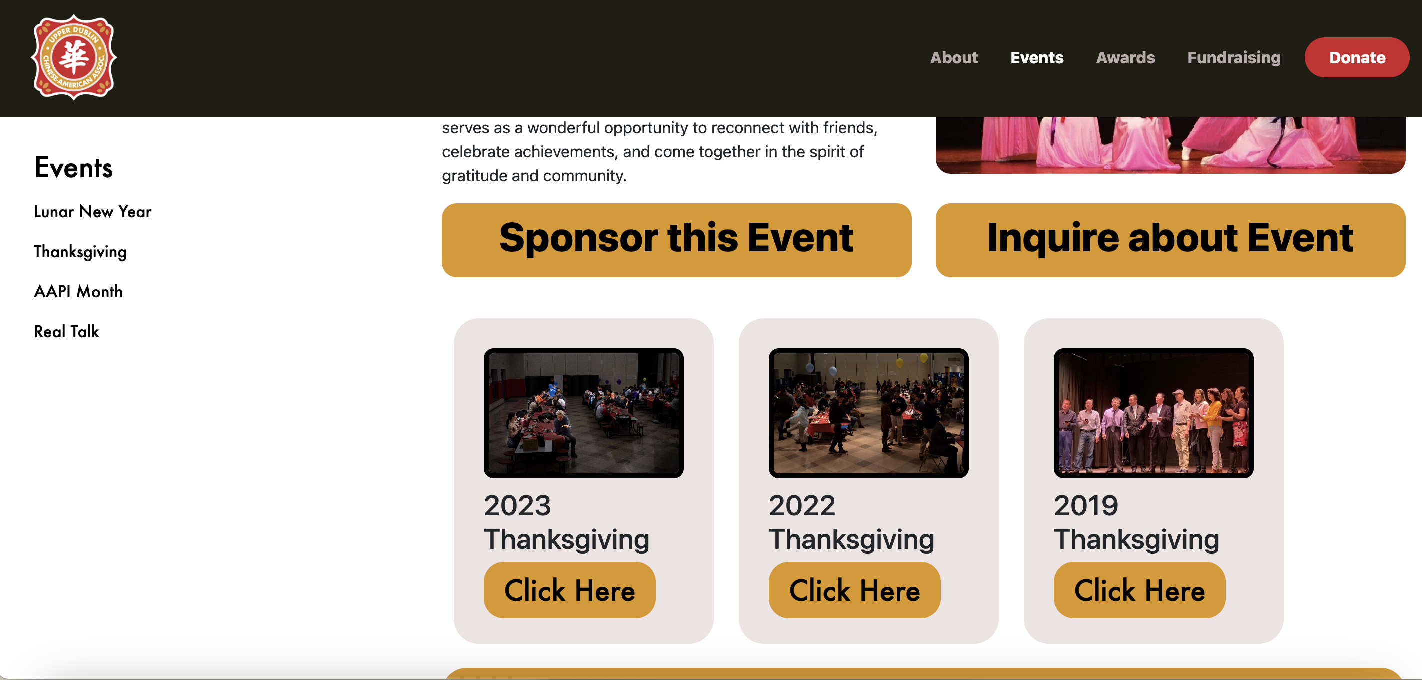
I also built a website for UDCA using HTML,CSS and Javascript. Their existing site lacked clarity so I focused on clear intuitive navigation and consistent branding.
Check out the new site here!
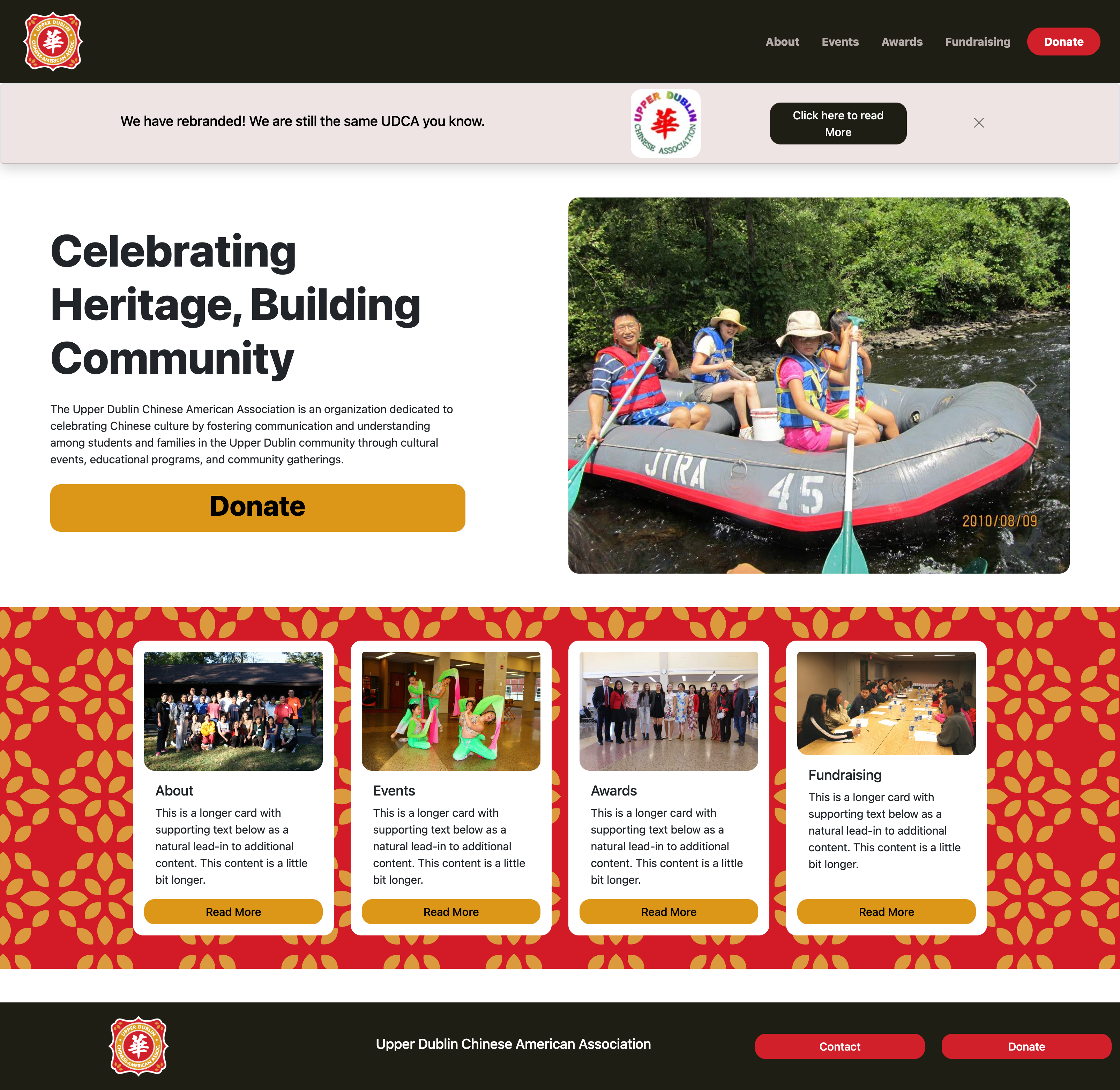
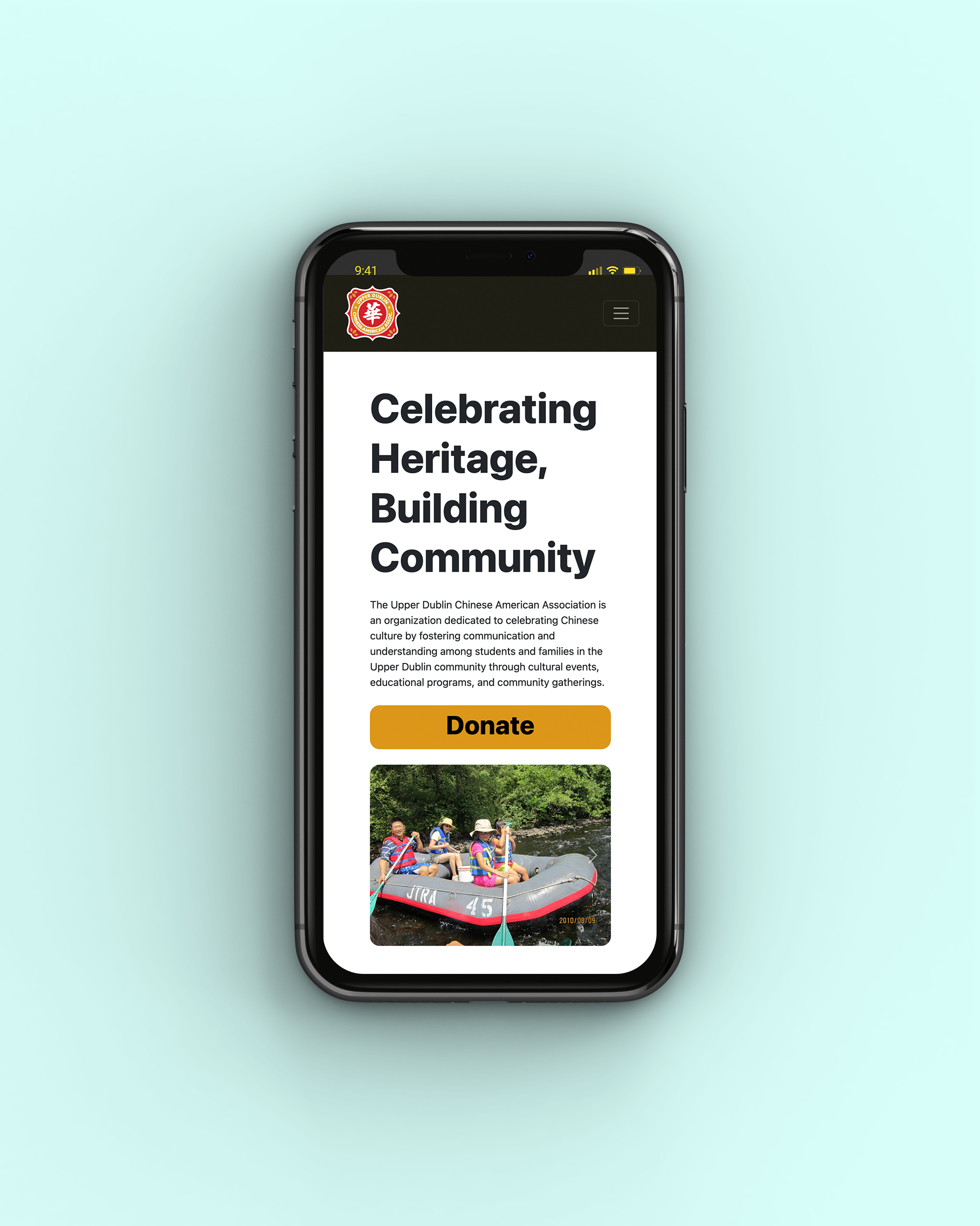
Equally important was optimizing the experience for mobile users, whether accessed on desktop, tablet, or phone.
One special element of the website is the ability to updated without touching the code. I did not want UDCA to have to edit the code everytime they updated the site with recent events. After some research I discovered a plug-in that would pull information from google Blogger so that all they had to do was post a blog. The code would then pull the title and image of the blog.